
Wandering their halls and atriums and corridors. Glancing sideways at priceless art as I make my way to new exhibitions. Plonking myself down in front of an epic triptych or scrunching myself into the corner of a small darkened room to watch a new video art installation. Learning a hundred things I didn’t know when I woke up that morning.
I’ve really been missing museums and galleries, so I’ve taken matters (and art) into my own hands this week.
Read on and discover five artworks from my travels that span four continents, various decades and whole worlds of artistic ingenuity.
Japanese woodcut printing
Where I found it
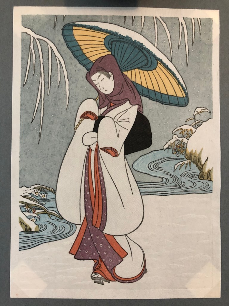
In 2018 I visited the Mokuhankan studio in the Asakusa area of Tokyo, hot and flustered after a very confusing metro journey, to take part in a woodcut ‘printing party’.
This woodblock (or woodcut) printing workshop was set up by American printmaker David Bull who moved to Tokyo about 20 years ago. He is something of a YouTube star, with 125k subscribers and videos that have racked up millions of views over the years.
Here’s the print I made at the workshop (sorry, party). The man himself popped by briefly and declared that I’d make a decent printer, but perhaps he says that to all the new recruits.
I was pleased with my efforts, but the woodcuts he creates and the designs Mokuhankan print blow mine a million miles out the water.
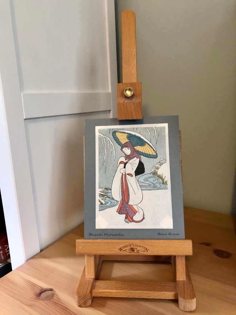
A snowy scene
This scene of a kimono-clad woman in the snow is one of the most iconic images in the entire ukiyo-e genre of woodblock printing that flourished in Japan during the Edo period of 1603-1868. It was designed by Suzuki Harunobu, the first printmaker to print in full colour – as opposed to a limit of two or three colours – in the 1700s.
The Heron Maiden
It was likely part of a series entitled Fashionable Flowers of the Four Seasons, representing winter of course. If you follow iconography of the time, she also represents Sagi Musume, the Heron Maiden of Japanese legend.
The Heron Maiden story was popularised in folk tales and the Japanese theatrical tradition of Kabuki. As the story goes:
A young woodcutter discovers a wounded heron, who he sets free. Later, a beautiful woman arrives in the village and he marries her. She is shown to be an expert weaver, producing beautiful clothes that he sells for lots of money at market. She pleads with him not to look in on her while she is weaving but he cannot resist. He walks in to find a heron at the loom. She can no longer live as a human, and she flies away.
Seeing it properly
Hopefully in the image above (you might need to zoom in) you can see some of the delicate embossing on the washi paper the design is printed — especially in the kimono pattern, the snow and her hood.
I’ve sat deep in thought with this print a few times recently, looking closely at all the delicate pigments and the patterns in the snow. It’s a stunner.
Aboriginal bark art

Far from home
I wish I could say I bought this work in Queensland where it was made, but I actually got it in a charity shop in nearby Sherborne, Dorset —10,382 miles away from where it was sold.
Originally the work was commissioned and sold by a company called Queensland Aboriginal Creations who describe it as an ‘authentic Queensland Aboriginal Artefact’. Is that true? I’ll get onto that.
The legend of the morning star
As QAC puts it:
The ‘Morning Star’ is an unusual bark painting which has several interpretations. In one of these it illustrates the legend of the Morning Star which tells how two women imprisoned the star all day and evening in a bag. The bag is represented by the swelling at the base of the main stem between the two women.
In another interpretation the picture represents a yam, and the swelling at the base is its tuberous edible root. The swelling on the stem above it represents the fruit. Blossoms decorate the end of each branch. Swellings on the branches on the left side show the places where the plant has twisted round a tree.
This remarkable picture is also a simple map of north eastern Arnhem Land and each blossom indicates a definite locality.

Digging a bit deeper
I spotted this article about an exhibition of QAC artworks called Agency and Legacy that was held at the University of Queensland’s Anthropology Museum in Brisbane last year. It mentions that Aboriginal people from Queensland were often asked to copy bark paintings from Arnhem Land in the Northern Territory next door.
This does obviously ring alarm bells. Why not let the Queensland Aboriginal people share their own creative heritage instead of copy from neighbours? Can copies really ever be called authentic?
On the other side of the coin, as the curatorial team puts it:
‘Despite these mandates (to copy certain artworks), Aboriginal and Torres Strait Islander artists and craftspeople were radically creative, producing works that contain traditional storytelling and finding innovative ways of expressing themselves and making a living for themselves and their families.’
Respect
Whether it is one of many copies of the same work, or a rarer reproduction of a neighbouring artistic style, I remain drawn to it as an example of the unique artistic talent of Aboriginal and Torres Strait Islander artists. I hope they were respected for their skills, and not taken advantage of, even though that has been a familiar story over decades.
Aboriginal and Torres Strait Islander art is more popular than it has ever been. Soon perhaps I can see the contemporary art scene for myself and maybe even meet some of the brilliant artists keeping their ancestral history and mythological beliefs alive today.
Indonesian batik printing
Background to batik
Evidence of batik printing can be traced 2,000 years back, with examples or references found in the Far East, Middle East and India.
According to the Batik Guild, ‘it is likely that the craft spread from Asia to the islands of the Malay Archipelago and west to the Middle East along the caravan trading route.’
The influence of the craft even stretches over to the tribes of southern Nigeria and Senegal, but the Indonesian island of Java is where batik mania reached its peak.

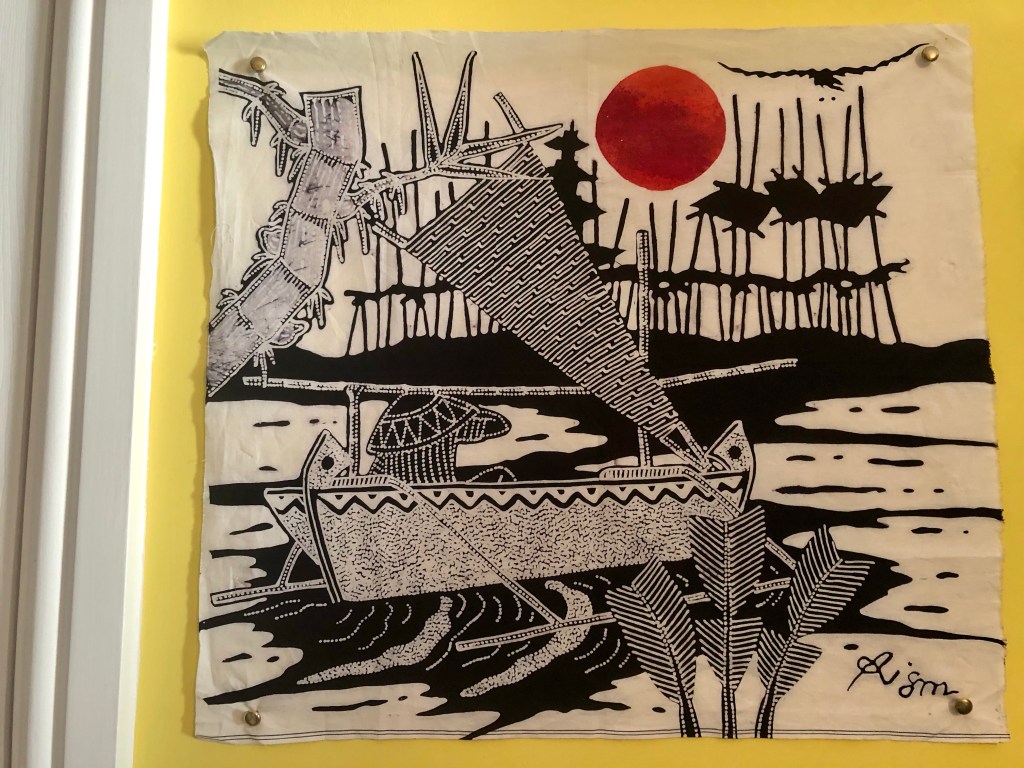
My batik print
And Java is where my print was bought, in the capital Yogyakarta. It was a birthday present from my brother Stephen who travelled around the islands of Indonesia and much of Asia in 2019.
If you browse batik designs, most are very pattern-orientated, often richly swathed in flowers. Mine is quite different; though there are dots and lines characteristic of the style, the print is a more painterly portrait of rural and coastal life.
Your eyes catch on the activity at the centre, is this person hauling up a fish or simply laying out a line? The clever use of dots under the boat conveys movement in the water, but the outcome of this fishing trip, under the flaring heat of a red sun, is left to our imagination.
The most frequently used colours in Batik printing are red, blue, yellow and brown. In this work, there are fewer colours and a painterly technique that sets it apart as a hand-drawn work created by one artist.
The technique
‘Batik’ derives from the Javanese word ‘tik’ which means ‘to dot’ and batik means both ‘to batik’ something and ‘a batik’ finished work or object.
Batik printing is seen as a craft as well as an art because it usually involves fabric and sometimes paper, wood, leather or ceramic. On the face of it, the technique of creating designs using wax and dye sounds simple enough but there’s more to it, particularly to hand-drawn tulis batik prints like mine:
- The cloth is hung over a frame and the design is drawn on with a canting (or tjanting), a small copper pen-like cupped spout with a bamboo or wooden handle.
- The canting is dipped into a pot of hot wax and then allowed to flow through the spout on to the fabric.
- To make a strong resist (i.e. a wax surface that will repel dye), both sides of the cloth are waxed.
- Once the design has been fully waxed, the fabric is usually dipped into a vat of dye and then left out in the sun to dry.
- The fabric is then immersed in boiling water to clean off the wax.
- The waxing, dyeing, drying, immersion process is repeated numerous times depending on the number of colours that feature in the print.
- Making Batik tulis is significantly more time consuming and therefore more expensive than hand-stamped designs which use copper stamps dipped in oil, and are useful for repeat pattern designs.
- You can watch a video of the process here, published by UNESCO when they placed Indonesian Batik on their Intangible Cultural Heritage list 11 years ago.
Indonesia is perfect for the art of batik because the materials needed – beeswax or pine resin, cotton, plants to make natural dye – are easily available. The batik industry is highly skilled and employs millions across Indonesia.
Though my print may not have the prettiness of a floral pattern design using lots of colours, I love the boldness of it and the fact that new details show themselves the more you look (eg at the bird). I have a new appreciation for just how skilled batik artists are.
First Nation art

The best kind of souvenir
I know this one is just a postcard, but I love postcards! I must own thousands and thousands, all squirrelled away in shoe boxes, except for a lucky group that are dotted about the house, on rotation.
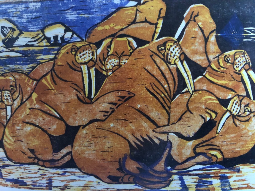
The postcard is a reproduction of the 1969 woodcut print Walruses by First Nation Inupiaq artist Bernard Tuglamena Katexac, one of numerous colourful works that are in The Anchorage Museum’s collection.
What I love most about this artwork is the contrast of golden hues against the blues and creams of the sky and the ice floes, the lazy gentle gestures between the creatures, as one leans peacefully on the next.
An Inupiaq artist
Katexac was born on King Island in 1922 to the very west of Alaska, the eldest of seven children. He grew up learning the Inupiaq skills of hunting walrus and seals, fishing and carving ivory, which he showed an especial aptitude for after leaving school.
Moving to nearby Nome in 1966 (where summers were always spent, but which was gradually welcoming more and more King Islanders permanently) Katexac started taking block printing classes.
He created this piece quite early on in his career, which is all the more impressive.
Never taking nature for granted
The Anchorage Museum, where I bought this postcard, was honestly one of the best museums I’ve ever been to. We only had a few hours to explore before leaving for northern Alaska, but of what we could fit in, the personal testimonies from First Nation groups struck me the most.
Presented in the Smithsonian Arctic Studies Centre that sits within the museum are hundreds of artefacts, written testimony and films — all connecting together the experiences of the first peoples of Alaska, their ways of life and their deep cultural heritage.
What came up time and time again was an expression of utmost respect for nature and for the animals that gave them sustenance. The sum of what many of them said has stayed with me: ‘when I look into the eyes of the creature I am hunting, there is an understanding that flows between us. There is a look in the animal’s eye that says it trusts me to respect it. Trusts me that I will make use of every part of it and not waste its death. That I will respect it and never forget it.’
Andes art

Where it was bought
In the last few days of my trip to Ecuador, we explored one of the capital Quito’s biggest markets, the Mercado Artesanal La Mariscal towards the south of the city.
I was in a heaven of haggling and browsing and buying, I really was. (Top tip: ask the price then don’t say anything else but keep looking at it in silence, which leads many vendors to fill the quiet with suggestions of price reductions).
At one stall I was struck by a table sagging with gorgeous paintings of the buildings and landscape of Quito and its surrounds, sold on behalf of one artist. I probably picked up his card but it’s lost now. The only clue I have to the artist is the signature which seems to read ‘Luchin’.
A ruby in the Andes
The painting has a beautiful simplicity of geometry going on. Your eyes lead swiftly up from two walkers on Quito’s streets, up past settlements and the church of San Francisco, to the Andes mountains that surround the city, up to the snow-capped majestic peak that seems to have levitated into the sky, as if craning its neck to reach the moon. Or is it the sun?
Quito is itself 9,252 feet up in the mountains, a UNESCO World Heritage Site dramatically placed in the heart of the Ecuadorean Andes. Perhaps the most famous of its mountains is Cotopaxi, a volcano I spent a few days in the shadow of, only a few hours’ drive from Quito. On a clear day, you are supposed to be able to see this very active volcano without leaving the city.
When we stayed for a few days in the Cotopaxi National Park in September 2016, we weren’t able to climb higher than the refuge because of the fallout from the previous eruption which has lasted from August 2015 – January 2016. It has erupted 49 other times since 1738.
What’s in a name
Earlier I didn’t sound sure as to whether the sun or the moon is depicted in the painting – though I see it as the moon. The origin of the word Cotopaxi isn’t clear cut either, but relates.
I read somewhere that in the Quechua language coto means ‘neck’ and paxi means ‘moon’. However, the Quechua language is mostly spoken in Peru and when cross-referencing the words in a Quechua dictionary, the word for moon is instead given as Quilla.
Ecuadorean mountaineer Marco Cruz believes the name comes from the Cayapa language of northern Ecuador (spoken by the Chachi people). Coto still means ‘neck’ but pagta / pa means ‘sun’ and shi / xi could be translated as ‘sweet’. Sweet neck of the sun?
Or else, in the poorly understood pre-Columbian Panzaleos language that was spoken by people indigenous to Quito, Cotopaxi apparently translates as ‘fiery abyss’.
Whatever it means (and it’s probably everything all at once), and whatever the artist’s original depiction, I’ve loved it ever since I stumbled one day into that market stall, on a gauzy, sunny day high up in the mountains years ago.
